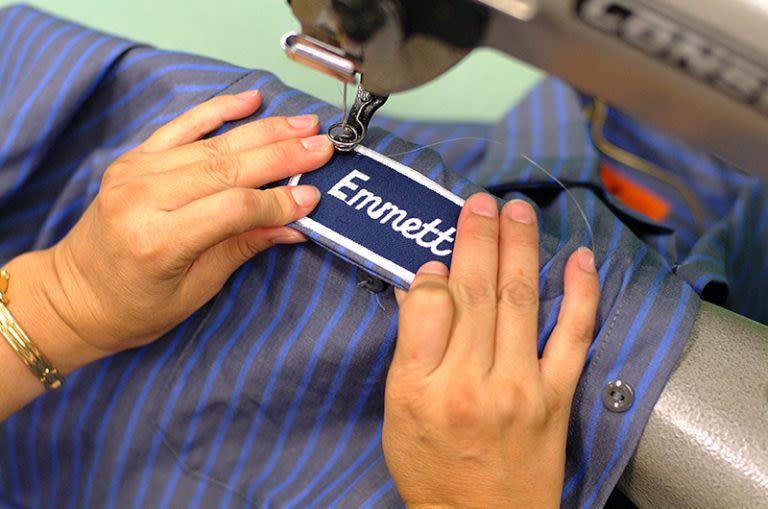
Logo placement on jackets and work uniforms can help a company effectively establish its brand identity. A company should consider where they want their logos, how large those logos should be, and how they affect the overall look of the jacket. Keep reading for tips on what to prioritize.
Logo Placement & Effective Branding
1. Readability
One of the most important elements of any logo being put on any piece of apparel or other kind of equipment is readability. Put another way, people should generally be able to understand what the logo is trying to convey.
Text is very important when considering readability. As a logo is reduced in size, any associated text should still be readable at a distance.
Images also “read.” If your logo depicts an animal or object, those things should be reasonably easy to identify as those things from at least several feet away. Otherwise, your logo may be too small or its details too intricate to work well when placed in the way you originally intended.
2. Placement
Logo placement, meaning its physical location on a jacket, can affect how a jacket projects your brand. The standard logo positions are typically on a breast pocket (or where one would be) and then a larger logo on the back. Some jackets may also have a logo on one or both shoulders. These are places where a person expects branding to be on clothing. If you want to subvert expectations, do so for a reason.
3. Sizing
It’s important to consider the size of any logo. If it’s not big enough, small details of a logo get lost, affecting readability. If the logo is too large, it may hijack the intended aesthetic of a jacket, sometimes making it look gaudy or just odd.
There isn’t one perfect size for a logo. The ideal size will depend on the specific look of your logo. Usually, logos look best when large on the back and smaller on the front or sides of a jacket.
4. Aesthetic
When making a jacket you want to be branded, aesthetic is broadly what needs to be considered at all times. How does the jacket look? Branded clothing shouldn’t just be a walking advertisement. If it doesn’t look good, it isn’t a positive representation of your brand.
At the same time, aesthetics aren’t everything. Your branding still needs to be recognizable, so people associate the jacket’s aesthetic with your company.
5. Differentiation
When making a branded jacket, consider what differentiates it from similar apparel items. Ideally, you don’t want a standard, generic jacket to have the potential to be nearly identical in appearance to your branded jackets. This makes the branded jacket less desirable to customers and less useful for extending your brand’s reach when worn (whether worn by customers or employees).
This is what makes a company’s logo useful. If people have positive associations with your brand, your logo being on clothes in a visually appealing way makes it both recognizable and desirable when compared to superficially similar apparel items.
6. Unobtrusive
All of the above needs to be balanced with the fact that people don’t usually want to feel like a walking advertisement or like another person they see wearing a jacket is simply advertising to them. It’s easy when designing branded clothing to focus so much on brand recognition and catching the eye that you forget that the best branded clothing often feels unobtrusive.
Oftentimes, two or three of your logos (at most) are going to produce the best result on a jacket, with only one of those logos (typically on the back) being especially large. Covering a jacket or custom work shirt in logos will look odd. Even if someone wears it, and people easily recognize your logo, it may look gaudy. Two or three logos is generally enough to have a logo visible from most angles on a wearer.
7. Consistency
Part of effective branding is consistency. Depending on where they’re placed, logos don’t necessarily need to be identical, but they should recognizably depict the same thing. For logos intended for clothing, one may have a logo with some text on the back of a jacket. If you also want a smaller version on the front, you don’t necessarily need the text (which might not read well when small), but the actual image used should either be the same as the larger logo or very similar.
At Alsco Uniforms, we value consistency. It’s part of how we’ve stayed in business for over 130 years. Consistent, aesthetically pleasing branding can help to reinforce a particular image in the minds of both the public and your staff. Consider whether it’s easier to remember an image you’ve seen only a few times versus one you have seen dozens. Consistency builds recognition and makes it easier for people to remember the services your company provides.
How Alsco Uniforms Can Help Your Branding
Logo placement on company jackets may seem simple, but it definitionally means that jacket is now an extension of the company’s image. It’s important to consider what kind of image that jacket is projecting. On a basic level, it should be aesthetically pleasing while still being recognizably branded, so people both like how it looks and link that feeling to the company.
If you’re looking for jackets to reinforce your company’s brand, reach out to us here at Alsco Uniforms. We have decades of experience in the uniform rental business, and we offer many related services, such as uniform cleaning services and linen rentals. We can help you design uniforms, jackets, and other apparel that reinforces your company’s brand. Reach out to us today to learn more.
